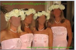
Now, you know monogram momma is all about all things pink and green and preppy in between, and especially when that comes to monogramming. However, that being said, there are times, when it is taken past the limit of what I feel is in good taste and proper etiquette. So for that reason, I feel it is my duty, a duty which I take most seriously, to share with you an example of monogramming gone too far (much too far). Just a little example for, you know, should any question or doubt arise in your mind at some point. Consider it a public service announcement, sponsored by monogram momma.

Please, people. I beg of you. Please try to use some decorum when deciding what you think should and should not be monogrammed. I really don’t think I need to point out all the very many bad places this bride has chosen to go with her wedding theme (and don't dare ask my opion on those ridiculous rose turbans either). Poor, poor girl. Bless her heart. *deep sigh*


19 Comments:
WOW! That is really taking monogramming too far! I had nervous giggles when I first looked at the picture!
I would like to know how those girls are even smiling. The pearls look nice though.
OMG That is just a bit too much. Talk about never wearing a dress again.
I spit my coffee out this morning looking at that picture...very funny...
Speaking of monograms, MM, the bracelet page at Franklin and Abbey is back up. They are only 16.00. About the dresses, they look like they have a table placemat across their chest. I guess they could cut the monogram out to sew on something else, or place the monogram in a glass frame for as a vanity tray. Anything to make this disaster come out productive.
This may be a dumb question, but I'm having trouble seeing the actual letters in the monogram... is the monogram their own initials, or are they all the same/the bride's monogram?
Wow, makes me think of what ranchers do to their cattle <:o ! Hilarious!
They are all different monograms. I am loving KiKi's idea though of cutting out the monogram and turning it into a vanity tray. LOL! And yes, they certainly do look "branded" like a bunch of cattle, and to be smiling too! LOL LOL LOL LOL (clearly, I am MOSt entertained by this post today!)
THAT is out of control. Thanks for the laugh!!!
Actually I don't think it's the dresses that make it that bad, it's the floral arrangement crowns that did it for me.
I love monogramming, but what in the world?? The dresses would be beautiful if they didn't have the monogram, but the "crowns" are just too much!!
Kelly
OMG! Once the picture loaded I could barely read the rest of the post I was laughing so hard. Once the "initial shock" (pun intended) wore off, I then found it hard to get past the turbans. Oh the humanity!
Bless their hearts. I like the monogram and I like the dresses, but I don't like the monogram on the dresses. And that headpiece. It looks like Santa Lucia day without the candles.
Oh, my!
I know ADP already asked, but wherever did you ever find this picture?
This pict has been making it's way around my circle for over a year and I knew it would come in handy some day! Apparently Wednesday was the day!
In this small 6 degress of separation world... I actually know through a friend of a friend that this picture is real. This girl knows 2 of these bridesmaids! Imagine her surprise to get this email foward and see her friends. Too funny!!!
Thank you for the laughs!
OMG, Ashley can you please let us know what the hell she was thinking with those head wreaths??? If I was a bridesmaid I would have drawn the line at those.
OMG I can't believe you actually know someone who knows someone who knws these girls!!!! I too, would VERY much like to know what in the HECK she was thinking! And what bridal consultant in their right mind woud encourage a bride to do this! The only girl who seems to be "on" to this cruel cruel joke by the bride is girl #2 (L-R).
maybe they're yankees? hehe!
Post a Comment